Being in marketing since the mid-90s, when it comes to websites, it seems I’ve seen and experienced everything. So, when it comes to an “exceptional” web experience it takes a lot to get my over-saturated, Gen X senses to perk up. I guess if someone designed an old retro site full of flame bursts, spinning logos, and old under construction pixel art, I would take notice.
That’s because, these days, creating an exceptional web experience means no one will take note. It’s the unexceptional, clunky, buggy or slow websites that get noticed.
So, what makes an exceptional experience? When I think exceptional website experiences, I think simple, seamless and convenient. Essentially, I am looking for an online experience that’s easy to use, intuitive, and personalized. When I come to a website or even an app, I don’t want to have to think. If I cannot immediately figure out where to go, what to do, or if it requires too many clicks, you have lost me (and likely, most of your users).
Learn about The Top 10 Key Metrics to Measure Website Effectiveness
Navigation
First question. Where do most people look for the navigation on a site? The top, right? So, most users do not want to search for the navigation – even if you think it is the most uniquely designed user experience ever created. Really, it is not cool to play hide the navigation from the user. In fact, it is just plain mean. So, practice good web design and put it at the top…next to the logo. Remember, people are creatures of habit and do not want the clever design to confuse the actual experience of using the site. For case and point of this, remember the short-lived tile concept of Windows 8.
However, while the placement of navigation should not be moved, you can create an exceptional user experience by adding your brand’s touch here. Whether it’s through clever brand vocabulary, imagery, or micro-moments.
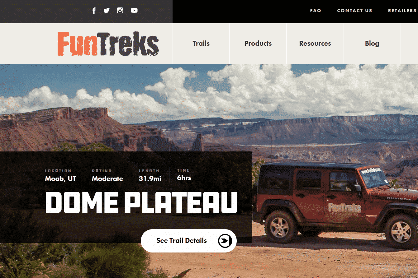
Icons
![]()
Also, use traditional icons. Most people are accustomed to and now look for icons they recognize to help guide their experience. Think about the shopping cart icon. On pretty much every website it is the same boring icon. It is the same one you see on Amazon, Target, and Lego (yes, I have kids). But, boring is OK in this case as everyone immediately understands them. In fact, it is the same reason all the icons on your car’s dashboard look that same from car to car and why they put the brake on the left. They are easily recognizable and people are comfortable with what they mean.
But, that doesn’t mean you can’t add your own flare through colors and branding. Also, while things like shopping cart, settings, search and social icons are standard, any icons unique to your brand are A-Okay.
Call To Action
Give me a clear call to action. Just one is fine, as long as it stands out and is big enough for my thumb on my smartphone. It’s also okay to have the same. Also, don’t hide the call to action. Employ visual hierarchy principles to make it stand out. Perhaps use different a color the draws my attention and position it where the eye is already trained to go.
Just like the other elements, call to action can have flare. Rather than just using “submit,” try to get creative, while staying on brand. If you are an exciting company that leads through unique experiences, maybe try “Begin My Adventure.” Don’t be afraid to tell your story and show creativity with them.
Personalization
Lastly, remember me. The app that I am geeking-out on at the moment is Starbucks because it remembers my previous orders. In fact, I cannot remember the last time I had to go to the menu items. Instead, all I need to do is go to “order” and it pulls up my previous orders. Then I can select from one of them and it will be waiting for me at the Starbucks around the corner. If for some reason I am not near my regular go-to Starbucks location, it can place the order at the and then navigate me to the front door. This was the very case last week when between little league games, my little outfielder needed a vanilla bean cream Frappuccino (which induced a couple of doubles and a triple). I just pulled up the app, found the nearest store, ordered the said “secret-baseball-hitting-creamy-blend-of-goodness” (aka SBHCBOG) and the app guided me to its pick-up location.
So, exceptional, you could say, is boring. That could be true. But today’s online experience is about saving time and convenience. Therefore, you don’t need to reinvent the wheel each and every time you build a website. Instead, build upon what is tried and true and what users are already used to. Then, add in elements that really do provide additional convenience and make your brand stand out, such as Starbucks remembering your orders and even helping you find the nearest store.
If you need a web developer to ensure your website is exceptional, we’d love to talk. For 24 years, Webolutions has helped hundreds of clients build outstanding websites. Call 303.300.2640 or contact us online today to get started!